BACKGROUND
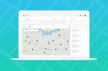
Kater is a BC-based, ride- on-demand service where users can easily request a ride to get to from point A to a nearby point B. Potential drivers apply online to provide their services.
THE CHALLENGE
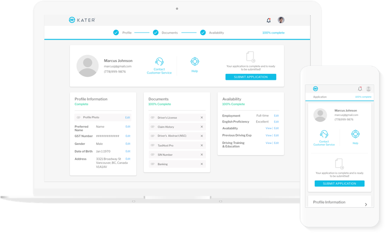
Kater needed a driver-onboarding web app where prospective drivers could apply and track their application. Applicants had to be able to access their application, complete their personal information and successfully upload required documents.
MY ROLE
I was tasked with the entire project from conception to launch. I collaborated with the customer service team to scope application requirements, wireframe, and prototype a responsive application portal. I worked as part of the development team to QA the product before release
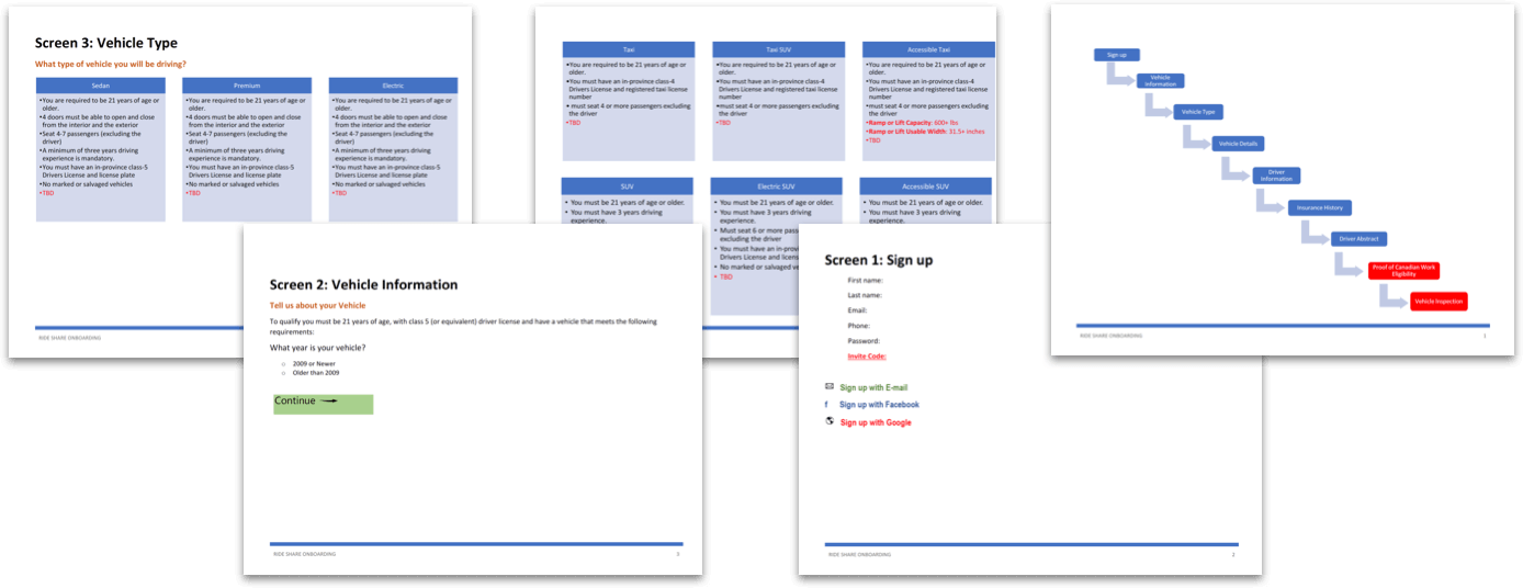
Initial documentation and content for the driving onboarding portal.
PROCESS
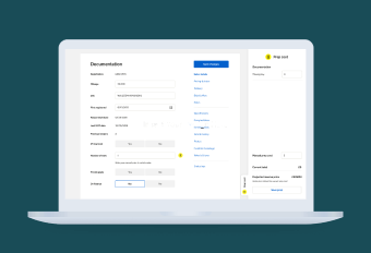
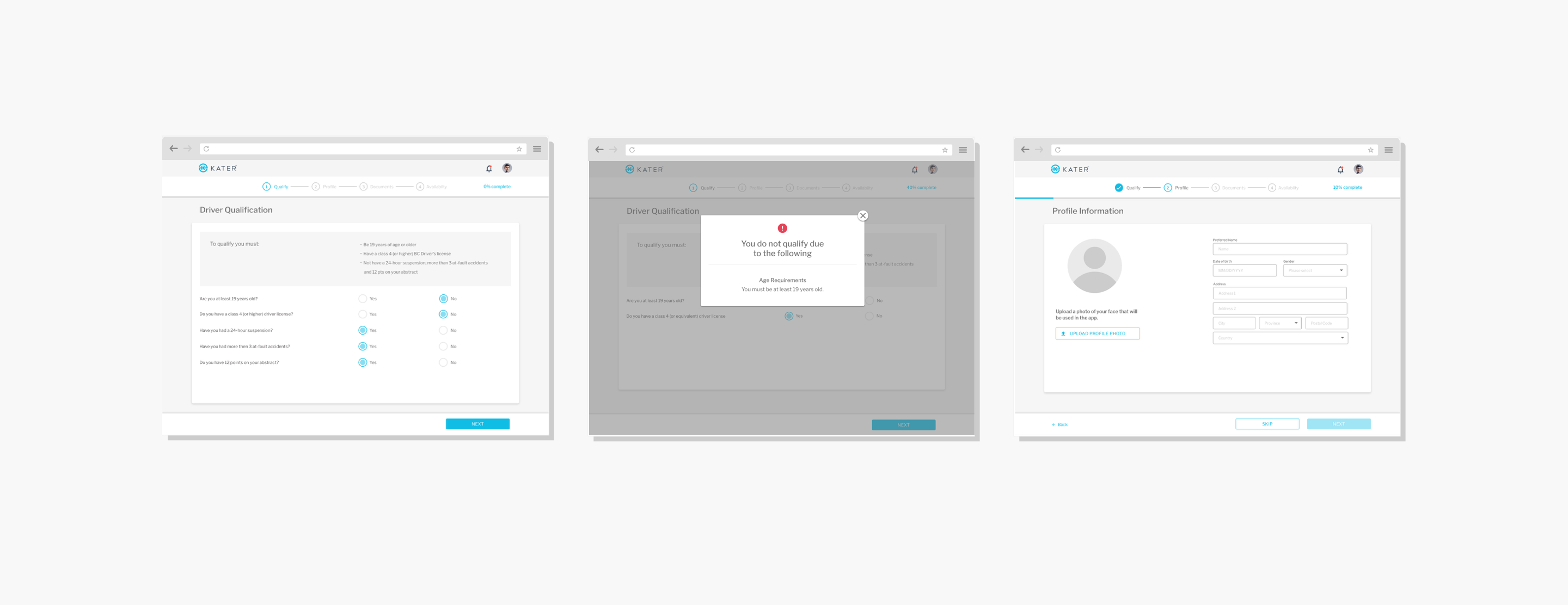
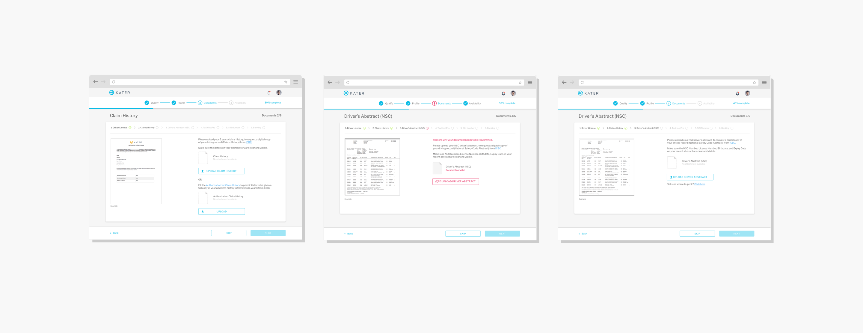
Partnering with the Customer Service team, I gathered and organized content and requirements for the driver onboarding app. I segmented the application to keep user input separated from instructions and background information from the company. I created user-input forms and added document upload functionality to ensure a complete and successful application.
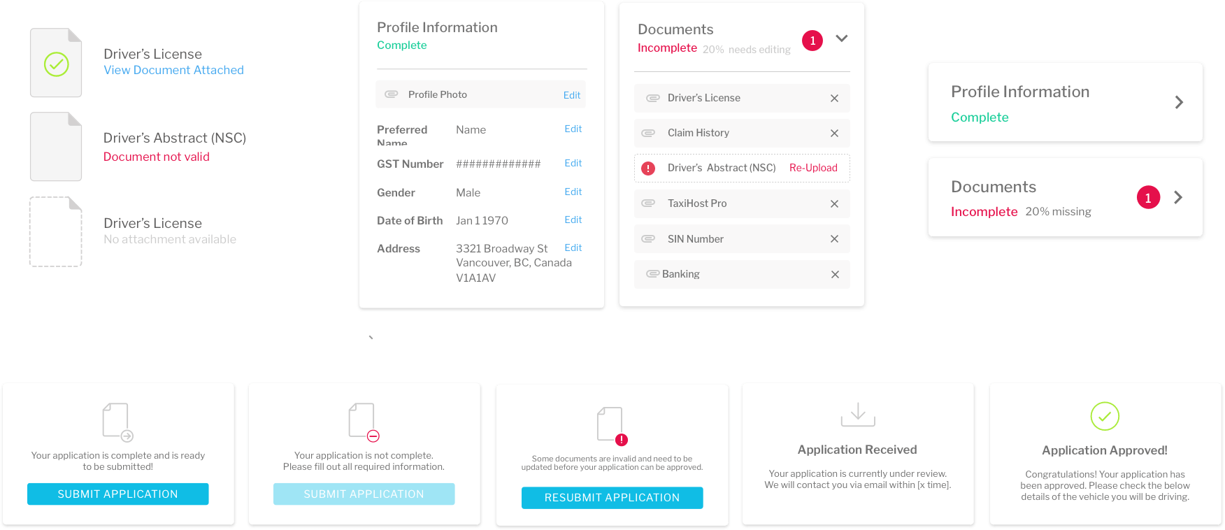
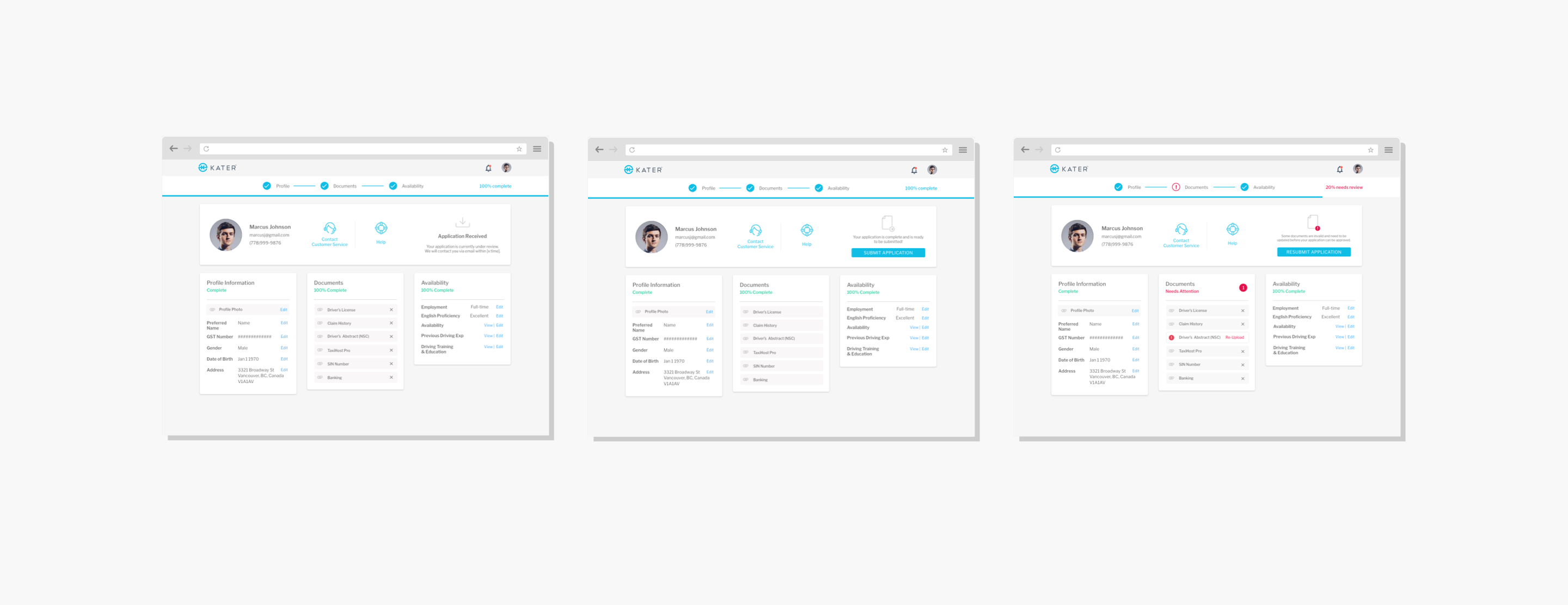
From left to right: Upload document states - no document attached, document not valid, document successfully attached | sections - complete - incomplete | application status - not ready to submit, ready to submit, resubmit, received, approved
KEEPING USERS INFORMED THROUGH DESIGN
Since the application process required a great deal of user inputs & documents to be uploaded, having clear and appropriate feedback was vital. A minimalist approach was pursued for the design as the goal was to show most immediate and relevant action the user needed to take at each step. This approach was reflected in the visual indicators ( icons, typographic variations), notifications and validations.
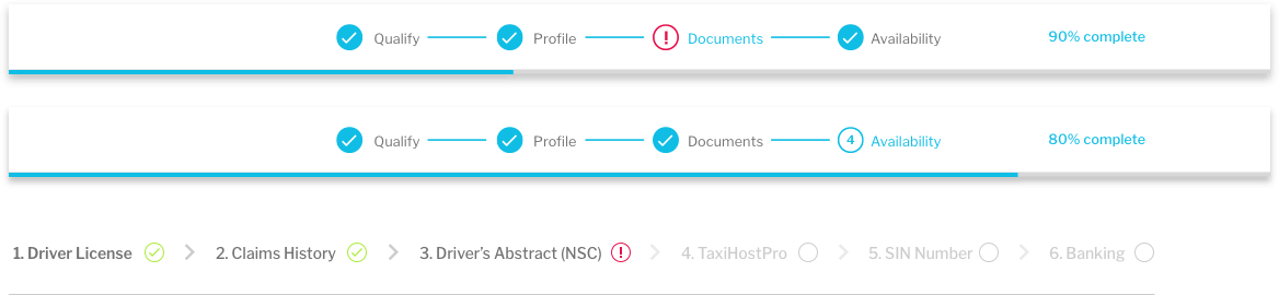
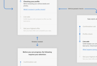
The applicant was split into multiple sections and was visually conveyed to show user progression. Some segments of the application even had subsections to show the number of documents required for upload.
PROGRESS INDICATION
Since the application is lengthy, it was important to visually show the user's progress throughout their application. This would help reduce uncertainty on the user's end. Research supports this and has also shown graphical progress indicators diminish the negative effects of waiting and increases user engagement.
Since the live release, a few thousand applicants have been completed with ease. It is safe to assume that the web interface is clear and informs the users well.