
BACKGROUND
Surex, Canada’s fastest-growing online insurance provider, was going through a branding rehaul.
THE CHALLENGE
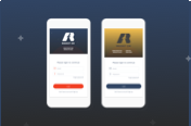
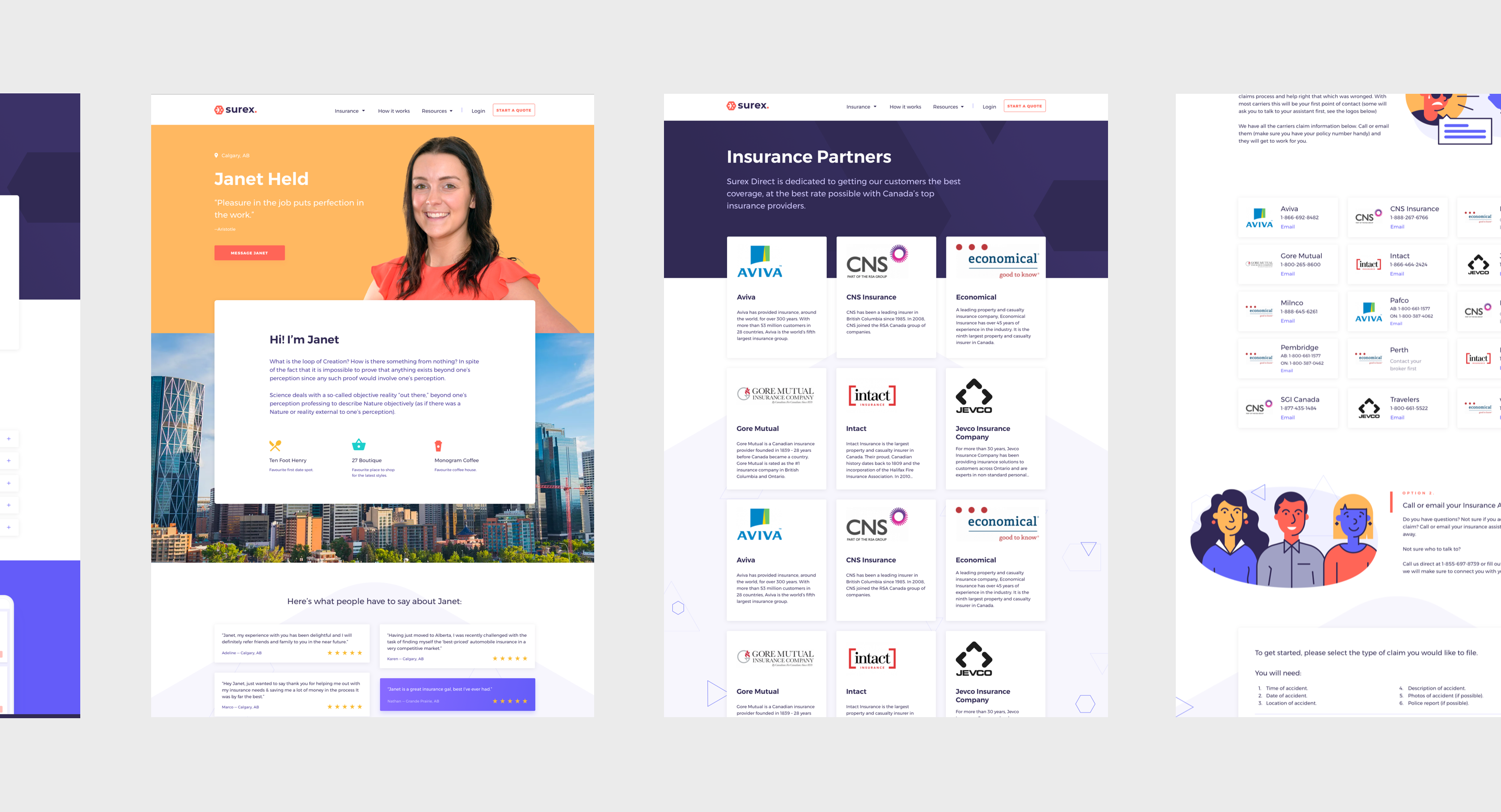
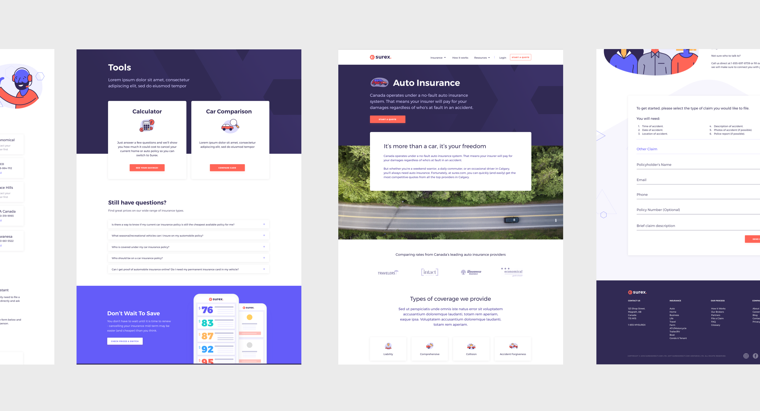
Surex’s marketing site needed to reflect its new identity. The existing website had several drawbacks: not being responsive, it wasn’t user-friendly, or easy to navigate.
MY ROLE
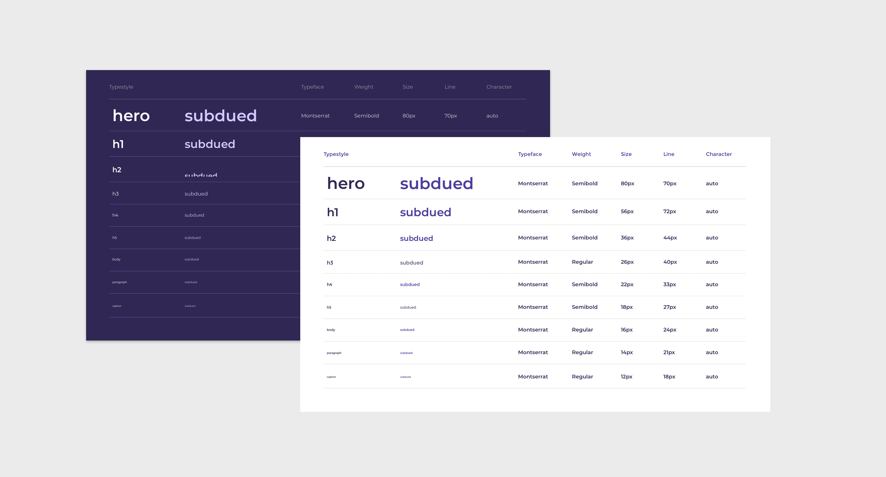
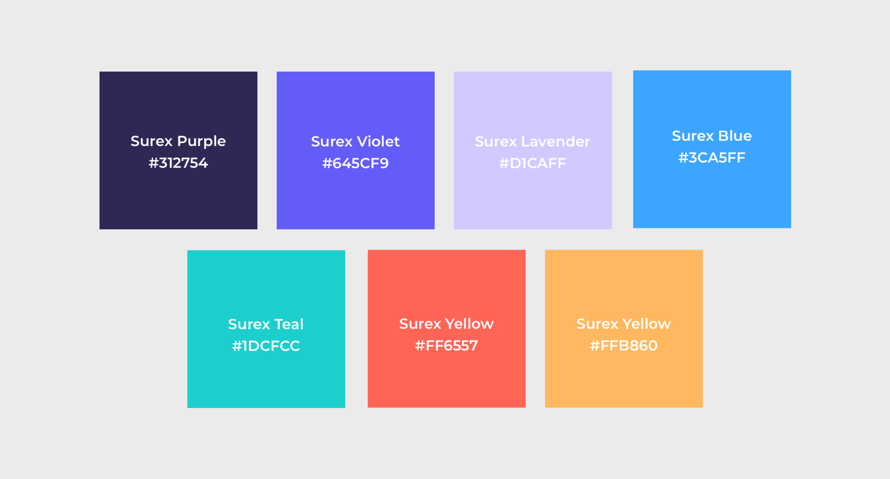
I created a visual style guide and component library. These ensure consistency and scalability as the brand and site continue to expand.
DESIGN COMPONENT LIBRARY
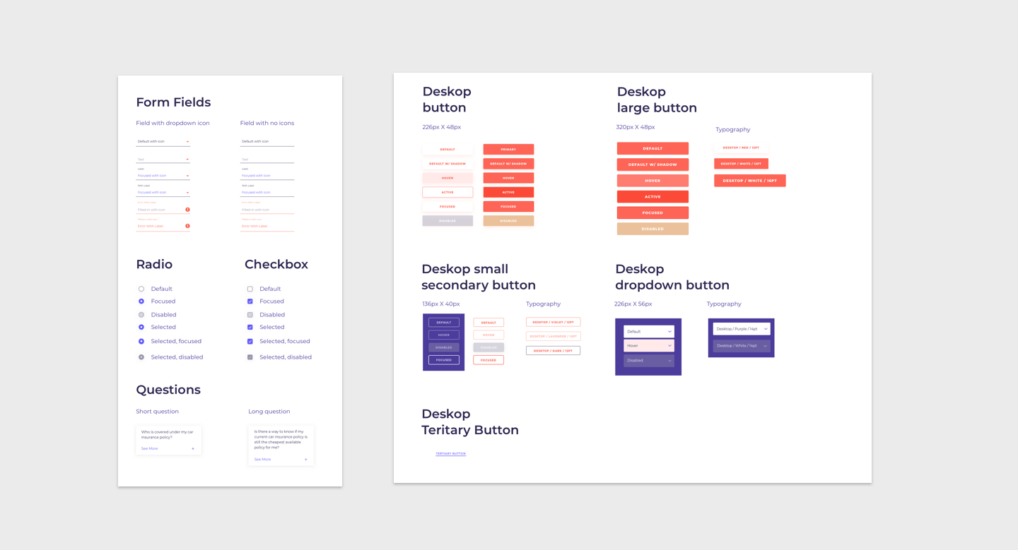
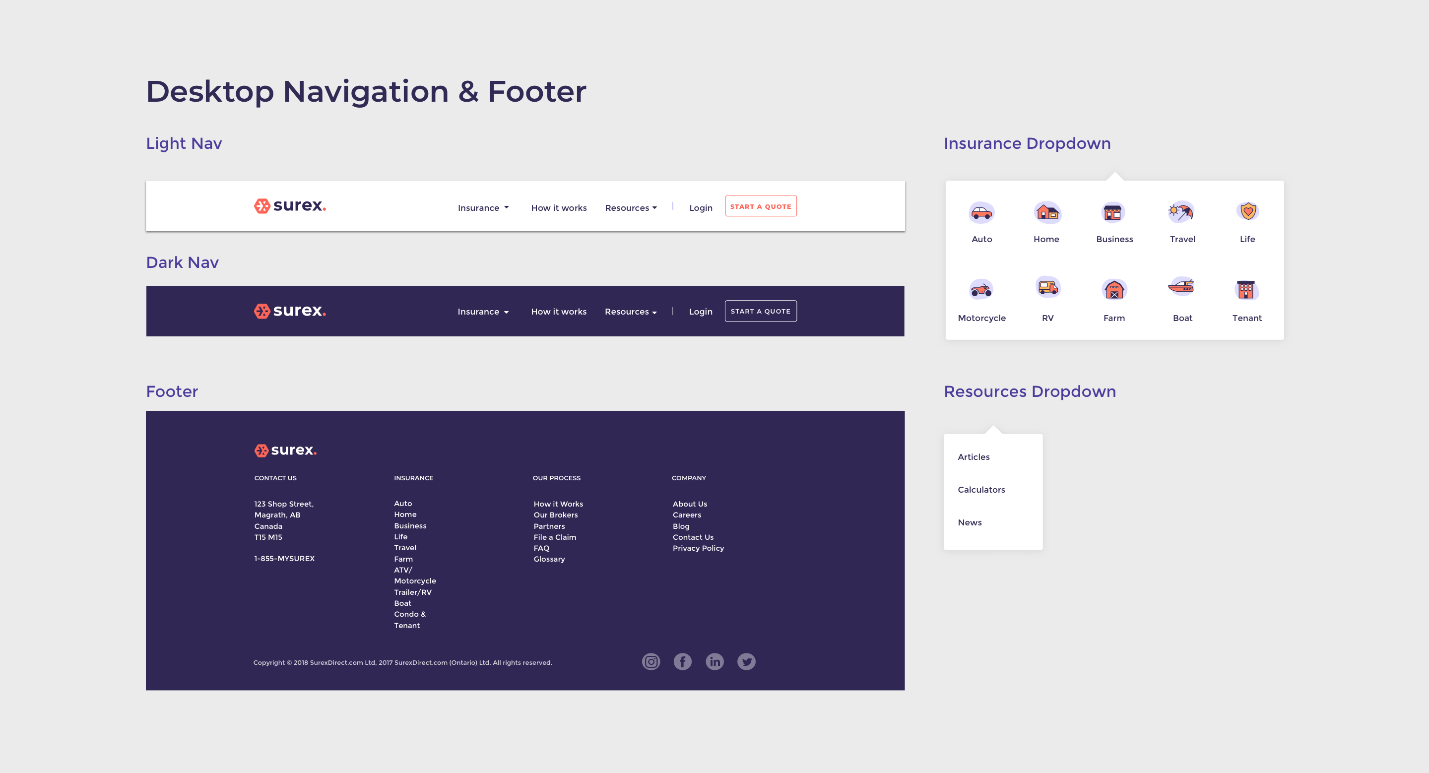
The marketing site’s design library consists of reusable components defined by the Surex brand’s concrete visual standards. Using Sketch and Abstract, I created an integrated suite of UX elements that includes buttons and input labels, collections of forms, menus, and tables, and checkbox, search, and dropdown modules.
RESPONSIVE & ADAPTABLE
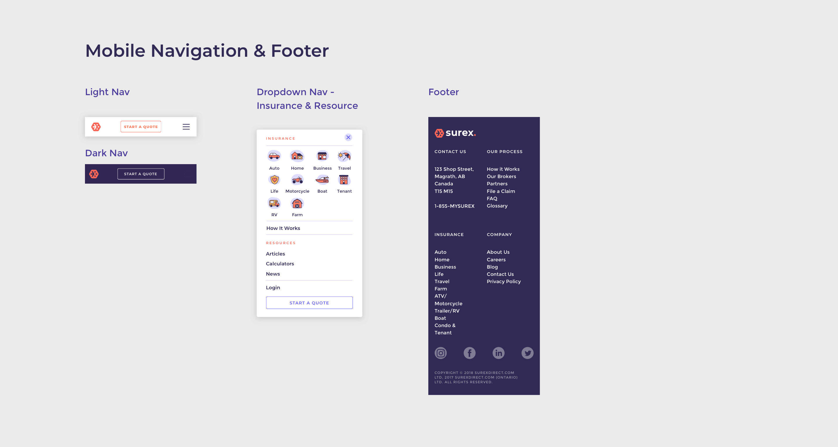
I made sure the mobile components were defined based on the viewing device, so each is responsive and looks great at any screen size.
Surex’s marketing website now has a cohesive design style guide that reflects the current rebrand. Thanks to the design component library, any designer that onboards the project at a later stage can add visually consistent pages quickly and easily.
